

The average eCommerce product page converts at 1.5–3%, per digitalapplied.com’s 2026 product page optimization guide. Top-performing stores hit 4–8%. That 2–3× gap is not explained by traffic quality, price point, or marketing spend — it is explained by specific, measurable product page decisions: image quality, social proof placement, copy structure, mobile UX, and add-to-cart accessibility. On Magento specifically, product pages built on Luma carry a structural performance disadvantage that Hyvä removes. This guide covers every element that moves the number, with sourced benchmarks for each.
| TL;DR — Key Takeaways |
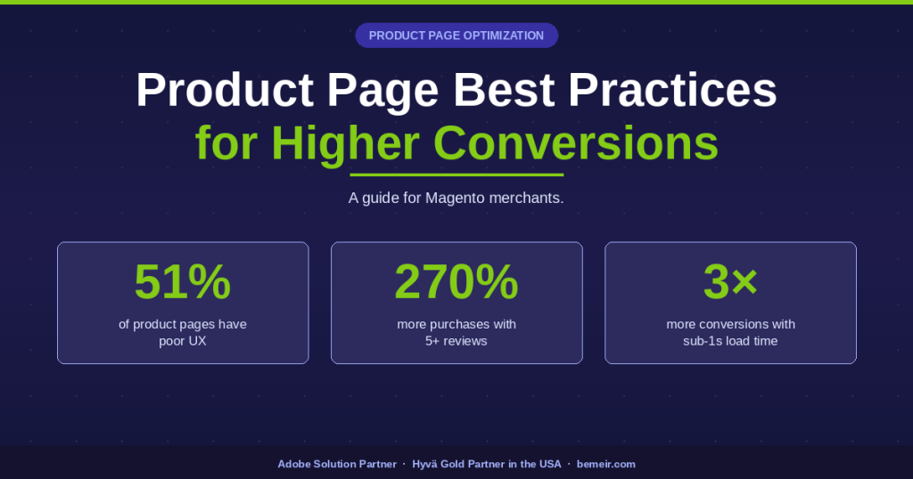
| 51% of eCommerce sites have a “mediocre” or worse product page UX, per Baymard Institute’s 2025 benchmark of 200+ sites. Most product page conversion problems are fixable UX issues, not product or pricing problems. |
| Products with five or more reviews are 270% more likely to be purchased than products with zero reviews, per the Spiegel Research Center. Reviews are the single highest-impact element on most product pages that lack them. |
| 73% of eCommerce traffic comes from mobile, but mobile converts significantly below desktop, per digitalapplied.com’s 2026 guide. Product pages optimized for desktop and not mobile leave the majority of traffic underserved. |
| Magento stores on the default Luma theme carry a structural performance disadvantage on mobile product pages. Hyvä ships 50–100KB of JavaScript per page versus Luma’s 700KB–1.2MB. Bemeir is the first and only Hyvä Gold Partner in the USA, with 12+ years of Magento experience. SD Bullion, a $1B GMV merchant, saw a 40% conversion lift after migrating to Hyvä with Bemeir. |
| 67% of product pages do not include customer photos or social media images, per Baymard Institute’s UX benchmark. This is one of the most common gaps between average and high-converting stores. |
A product page has one job: give the shopper enough information and confidence to add the product to their cart. Every element on the page either supports or undermines that goal. The best product pages are not the most visually elaborate — they are the ones that answer the buyer’s questions in the right order, at the right moment, without friction. On Magento, optimizing product pages involves both the content layer (images, copy, reviews, CTAs) and the performance layer (page speed, mobile UX, Core Web Vitals). This guide covers both.
1. Product Photography: Volume, Quality, and Context
Product photography is the most direct substitute for the in-store experience. When a shopper cannot touch, try on, or examine a product, images carry the entire sensory burden of the purchase decision. Most product pages underinvest here relative to the conversion impact.

What the research says
67% of eCommerce sites do not offer customer photos or social media images on product pages, per Baymard Institute’s UX benchmark. When shoppers cannot find contextual images on a product page, they go off-site to find them — and risk landing on a competitor’s page in the process. Peepers Eyewear saw a 30% conversion lift after upgrading their product page media with larger, higher-quality images, per Shopify’s 2025 PDP guide.
Specific requirements
- Five image types are required for a complete product page, per studiowombat.com’s 2025 product page analysis: hero image (the primary visual that communicates the product immediately), detail shots (close-ups of materials, textures, or unique features), scale references (size or dimension context), variation images (showing color, size, or style options), and in-use demo images (lifestyle context with the product being used). Six or more images per product is the target.
- Minimum 1,500 × 1,500px for zoom functionality. Optimize delivery in WebP or AVIF format — same visual quality at 25–50% smaller file size, per digitalapplied.com’s 2026 guide.
- Lifestyle context is not optional. Furniture needs room context. Apparel needs a model. Products need scale reference. Without it, shoppers cannot visualize ownership.
- Social media images and customer photos belong on the product page, not just in a review section below the fold. Users actively seek them before purchasing, per Baymard Institute.
- Video for products above $100 or with any tactile dimension (texture, material, fit). A 15–30 second product video on the primary image slot reduces return rates and increases add-to-cart rate.
- Dynamic image swapping: as customers select product variants (color, size, material), the primary product image should update instantly to reflect the selected option. This eliminates the “I wonder what the blue one looks like” hesitation that causes shoppers to leave the page to search for more images, per studiowombat.com’s 2025 guide. On Magento, configurable product image swapping is native; on Hyvä it uses Alpine.js reactivity for instant, no-reload updates.
On Magento
Magento’s native product gallery supports zoom and multiple images but does not natively handle WebP conversion or lazy loading optimally on Luma. On Hyvä, images are served with Tailwind CSS layout and Alpine.js-driven gallery interactions, which load significantly faster on mobile. Gallery components in Hyvä are also far simpler to customize than Luma’s KnockoutJS-based equivalents.
For stores struggling to manage complex product catalogs or optimize gallery performance, our Magento development services can help align your infrastructure with modern requirements.
2. Product Descriptions: Structure Over Length
The right length for a product description depends on the product category and the buyer’s decision process, not on SEO word count targets. The question to answer is: what does this buyer need to know to feel confident purchasing?
Structure the description to answer three questions in sequence
High-converting product descriptions follow a three-question structure, per studiowombat.com’s 2025 analysis: (1) What problem does this solve? Open with the outcome or problem the product addresses. “Sleep better on hotel-quality sheets” captures attention faster than “1,000-thread count Egyptian cotton.” (2) What exactly am I getting? List features and specifications in a scannable format. (3) Why should I trust this will work? Proof points, quality standards, or specific customer outcomes. This sequence matches the buyer’s natural decision process and reduces the hesitation that causes drop-off.
Length by category
For impulse purchase items under $50: brief bullet points covering key benefits convert better than long-form copy. For complex or expensive products: longer descriptions convert better — up to 1,000 words in B2B and high-consideration categories, per digitalapplied.com’s 2026 product page guide. The determining factor is not product type but buyer hesitation. More hesitation = more information needed.
Structure
- Lead with benefit, not feature. “Ships in 48 hours” is a feature. “On your doorstep by Thursday” is a benefit. “These are the warmest slippers you’ve ever worn” beats “Insole made of lambswool,” per hertwill.com’s product page guide. Lead with what it means for the buyer, then substantiate with the feature.
- Use a scannable bullet format for specifications and a short paragraph for the value proposition. Do not bury the value proposition in a paragraph of specifications.
- Answer the top three objections in the description. What do customers most often ask before buying? For apparel: sizing and fit. For electronics: compatibility. For consumables: ingredients. Address them before the question is asked.
- Avoid manufacturer boilerplate. Copied spec sheets and generic descriptions are detected by shoppers and do not differentiate the product. Rewrite in the brand’s voice.
On Magento, accordion-style description layouts — with tabs for “Description,” “Specifications,” “Shipping & Returns,” and “Reviews” — keep the above-fold area clean while making full information available on demand. Hyvä’s Alpine.js accordion components render significantly faster than Luma’s KnockoutJS equivalents, and are simpler to style and extend,as explained in detail in our Hyvä module compatibility article.
3. Reviews and Social Proof: Placement and Volume
Reviews are essential infrastructure for your product pages, not just an optional feature. According to the Spiegel Research Center, items with five or more reviews are 270% more likely to be purchased than those with none. Furthermore, ProveSource’s 2026 social proof statistics reveal that 92% of consumers hesitate to buy when no reviews are visible. The lack of reviews isn’t a neutral state—it acts as a direct barrier to conversion.
What to display and where
- Star rating and review count: display directly below the product title, above the fold. This is the most-checked element after the primary image. Never bury it below the description.
- Optimal rating: purchase likelihood peaks at 4.2–4.5 stars, not 5.0, per research from Northwestern University’s Spiegel Research Center cited in ProveSource. A perfect 5.0 rating with few reviews triggers skepticism; 4.3 with 200 reviews converts better than 5.0 with eight.
- Customer photos: embed above the fold or in a UGC carousel adjacent to the product gallery. 72% of consumers trust customer photos more than stock images, per wisernotify.com’s 2026 statistics. UGC galleries on product pages increase conversion rates by up to 166%, per the same source.
- Review recency: 83% of consumers consider reviews older than three months irrelevant. Implement automated review request emails post-purchase to maintain a steady flow of recent reviews.
- Review content: full written reviews below the fold, searchable and sortable by rating and date. Include a summary of common themes at the top of the reviews section.

Trust signals beyond reviews
Baymard Institute’s analysis of 147 eCommerce sites found that trust signals increased conversions by 15–30% on average, per userintuition.ai’s trust UX research guide. However, pages with seven or more trust signal types converted 8% worse than pages with one to three types — too many signals create visual noise and imply the store is working too hard to appear trustworthy. Place trust signals where the buyer needs reassurance: security badges near add-to-cart, return policy near the price, and payment options visible before checkout.
4. The Add-to-Cart Button: Visibility, Position, and Friction
The add-to-cart button is the conversion moment. Every design decision about it should prioritize the buyer’s ability to find and use it without friction, not visual elegance or brand consistency.
Above the fold, always
The add-to-cart button must be visible without scrolling on every device. On mobile, this means a sticky add-to-cart bar that persists as the shopper scrolls through the description and reviews. Stores without a sticky CTA lose buyers at the bottom of long product descriptions who intended to buy but lost the button. The sticky CTA is one of the most consistent A/B test winners on product pages.
Button design
- Use a contrasting color that stands out from the page background. The contrast matters more than the specific color — one test found a contrasting button color increased conversions by 21%, per mindfeederllc.com’s 2025 design research.
- Button text: “Add to Cart” outperforms “Buy Now” for considered purchases and multi-item orders. “Buy Now” outperforms for impulse items with simple SKU selection.
- Button size on mobile: minimum 44px height, per Apple and Google tap target guidelines. Buttons that are too small create tap errors, especially for older users on smaller devices.
- Whitespace: surround the CTA with breathing room. A button buried in a dense block of text or specifications receives significantly fewer clicks than the identical button with clear surrounding whitespace.
Variant selection
If the product has variants (color, size, material), the variant selector must be resolved before the add-to-cart button becomes active — and the unselected state must be clearly communicated. Baymard Institute’s benchmark testing found that unclear variant selectors are one of the top causes of add-to-cart failure on product pages. Use visual swatches over dropdown menus where the variant has a visual dimension (color, pattern). Use buttons over dropdowns for size selectors where options are limited.
5. Pricing, Promotions, and Shipping Costs
Pricing presentation affects perceived value before the shopper makes any judgment about the actual price. How the price appears — its size, position, and surrounding context — shapes the purchase decision independently of what the number is.
Price display
- Display the price prominently and unambiguously, adjacent to the product title and CTA. Price should never require the buyer to scroll to find it.
- If the product is on sale, show both the original and sale price with the percentage savings. “Was $120, now $89 (26% off)” converts better than “$89” alone or “Save $31”.
- For products sold by quantity or subscription, show the per-unit price clearly alongside the total.
- Do not show prices that require the buyer to calculate. “3 for $24” is worse than “$8 each — buy three for $24.” Cognitive load at the price decision reduces conversions.
Shipping cost transparency
75% of US shoppers expect free shipping even on orders under $50, per NRF research cited by ringly.io. Free shipping increases conversion rates by 20%, per the same source. If your store offers free shipping above a threshold, that threshold must be visible on every product page, not just the cart. “Free shipping on orders over $75 — you’re $12 away” is one of the highest-converting prompts available on a product page, as it simultaneously communicates the shipping benefit and increases average order value.
For products where exact shipping cost depends on the buyer’s address, show a shipping cost estimator or a range on the product page rather than deferring cost visibility to checkout. Unexpected shipping costs at checkout are the leading cause of cart abandonment, cited by 48% of US abandoners, per Baymard Institute.
6. Mobile Product Page Optimization
Pages loading in one second convert three times better than pages loading in five seconds, per emplicit.co’s product page structure guide (February 2026). On mobile this threshold is critical: 53% of mobile users abandon a page that takes more than three seconds to load, per research cited at shno.co. The three-second mobile load target is the most important technical benchmark on a product page.
73% of eCommerce traffic comes from mobile, and 58% of purchases now happen on mobile, per digitalapplied.com’s 2026 product page guide. The gap between mobile traffic share and mobile conversion rate is the single largest conversion opportunity for most Magento stores. Most product page optimization guides focus on desktop layouts and treat mobile as an afterthought. That prioritization is backwards.
Mobile-specific product page requirements
- Sticky add-to-cart bar: the CTA must persist on screen as the buyer scrolls. This is non-negotiable on mobile product pages.
- Image gallery: full-width swipeable image carousel, not a grid. Thumbnails below the primary image are a desktop pattern that fails on mobile — they are too small to tap accurately.
- Tap target sizes: every interactive element — size selector, color swatch, quantity input, add-to-cart button — must be at least 44px in height. Thumb zones matter: primary CTAs belong in the lower two-thirds of the screen where thumbs naturally reach.
- Accordion sections: use expandable sections for description, specifications, shipping, and reviews. Full content expansion on mobile product pages forces excessive scrolling that reduces conversion.
If your architecture is holding back your mobile speed, see our analysis on why merchants are returning to native frontends for faster, cleaner performance.
- Autofill-compatible form fields: if the product page includes any input (quantity, personalization text, gift message), declare the correct input types to trigger native mobile keyboards and autofill.
Page speed on mobile
A one-second delay in page load time reduces conversions by approximately 7%, per the Deloitte “Milliseconds Make Millions” study commissioned by Google (deloitte.com). Mobile users on 4G connections experience Luma’s JavaScript waterfall at its worst — 700KB to 1.2MB of JavaScript loading sequentially before the product page becomes interactive. Hyvä ships 50–100KB. The performance difference is not a refinement; it is structural. Stores on Luma cannot achieve mobile product page load times that compete with Hyvä stores through optimization alone, because the RequireJS module loading waterfall is architectural. For Hyvä migration services, see bemeir.com/hyva/.
7. Urgency, Scarcity, and Real-Time Social Proof
Legitimate urgency signals — low stock counts, shipping deadlines, and real-time activity indicators — lift product page conversion by 8–32% in controlled A/B tests, per digitalapplied.com’s 2026 product page guide. The word “legitimate” is load-bearing. Fake urgency — countdown timers that reset, inventory counts that never change, “only 2 left” that persists for weeks — is detected by shoppers and destroys trust permanently.
What works
- Low stock warnings: show actual inventory counts when stock falls below ten units. “Only 6 left in stock” is credible and creates genuine urgency. “Only a few left” is vague and ineffective.
- Shipping deadlines: “Order within 3 hours for delivery by Thursday” is one of the most conversion-effective prompts on a product page. It creates urgency around the delivery outcome rather than the stock outcome. Update dynamically based on time of day and shipping carrier cut-offs.
- Real-time purchase notifications: small indicators showing recent purchase activity (“14 people bought this in the last 24 hours”) lift conversions by 10–15% on average, per ProveSource’s 2026 statistics. They create trust through demonstrated demand.
- Live visitor counts: “47 people are viewing this product” reduces bounce rates by up to 21%, per ProveSource. Use only when the count is real and the product genuinely attracts concurrent viewers.
What does not work
Countdown timers that reset when the session reloads are detected by repeat visitors and destroy credibility for the brand. Generic “limited time offer” banners with no expiry date are ignored. Inflated viewer counts on products with minimal actual traffic are detectable through inconsistency with review counts and sales velocity.
8. Cross-Sell and Related Products
Cross-sell and related product placements on product pages serve two functions: increasing average order value when the buyer adds the primary product, and retaining buyers who decide the primary product is not quite right. Both outcomes are valuable. The placement, logic, and presentation of related products determines which outcome they drive.
Placement
- Below the primary product content, not above. Related products above the fold compete with the primary conversion goal and reduce add-to-cart rates for the main product.
- Frequently bought together: positioned directly below the add-to-cart button, with a single combined add-to-cart action. This format — “customers who bought X also bought Y” with a bundle add-to-cart — is the highest-converting cross-sell placement on product pages.
- Similar products: shown below or in a sidebar for buyers who scrolled past the primary product without adding to cart. This is the retention function of related products.
Recommendation logic on Magento
Magento’s native related products, up-sells, and cross-sells are manually curated and static. For stores with large catalogs, AI-powered recommendation engines — Nosto, Klevu, or Adobe Sensei on Adobe Commerce — deliver dynamic recommendations based on behavioral data. Personalized product recommendations increase conversion rates by 10–25% depending on implementation quality, per genaiembed.ai’s 2026 eCommerce CRO guide. For Magento stores with catalogs above 500 SKUs, manual curation of related products is not operationally realistic and AI-driven recommendations provide a material conversion advantage over static placements.
9. Product Page SEO: Schema Markup, Meta Titles, and Discoverability
Product page SEO determines whether your optimization investment results in traffic that finds the right product. Three elements carry the most direct conversion impact: structured data markup, keyword-aligned titles and meta descriptions, and product page analytics.
Schema markup (structured data)
Implementing schema.org Product markup on every product page enables Google to display rich snippets in search results: star ratings, price, and availability status alongside your organic listing. Rich snippets increase click-through rates without requiring any improvement in ranking position. Structured data fields to implement: name, description, image, sku, brand, offers (price, priceCurrency, availability), and aggregateRating (where reviews exist). On Magento, structured data is configured through the store configuration or via extensions such as structured data extensions available on the Magento Marketplace. On Hyvä, structured data outputs are cleanly rendered without the JavaScript rendering issues that can cause Luma to output incomplete markup, per visibleone.com’s product page optimization guide.
Meta titles and product page titles
Every product page must have a unique meta title and meta description. Default Magento configurations often output the product name as the meta title without any additional keyword context, which wastes the most visible SEO real estate on the page. A well-constructed product meta title follows the pattern: [Product Name] — [Primary Keyword] | [Brand]. For example: “Women’s Merino Wool Base Layer — Moisture-Wicking Hiking Shirts | BrandName.” The product title on the page itself should be clear, understandable, and in the correct market language — a product title in English on a German-market store is a conversion killer, per hertwill.com’s product page optimization guide.
Analytics: find high-traffic, zero-sales pages
Use GA4 or the Magento admin analytics to identify product pages with significant traffic but no sales. These pages are the most valuable optimization targets because the demand exists and the traffic is arriving — the page is simply failing to convert it. Compare the layout, images, descriptions, and review count on converting pages versus non-converting pages: the differences reveal which elements matter most for your specific catalog, per hertwill.com’s product page guide. Heatmap tools such as Hotjar or Microsoft Clarity show where users click, scroll, and abandon on individual product pages — which is where to start A/B testing, per visibleone.com.
10. Embed a Product FAQ Section
A dedicated FAQ section on each product page serves three functions simultaneously: it answers the objections that would otherwise prevent purchase, it reduces pre-sale support contacts, and it provides structured content that helps the page rank for question-based search queries. Most eCommerce stores confine FAQ content to a separate site-level FAQ page, leaving buyers to navigate away from the product page to find answers to product-specific questions, per contentstatus.com’s product page optimization guide.
What to include
- The top three to five questions your support team receives about this product. If you do not know what these are, check your support ticket history, Trustpilot or Google reviews for common questions, and customer emails. The questions that prompt support contacts are precisely the ones preventing purchases.
- Sizing, fit, and compatibility questions for the category. For apparel: how does it fit relative to standard sizing? For electronics: which devices is this compatible with? For consumables: is this suitable for [specific dietary requirement or skin type]?
- Delivery and returns: specific delivery windows by region and the exact return window and conditions. “Returns accepted within 30 days, no questions asked” converts better than a link to the returns policy page.
- Warranty and durability questions for considered purchases. Shoppers evaluating a $150+ product want to know what happens if it breaks in six months.
Implement FAQPage schema markup on the product page FAQ section to enable Google to display individual Q&A pairs in search results. This can generate additional organic click-through from search without any ranking improvement.
11. A/B Testing: What to Test and in What Order
A/B testing on product pages requires a disciplined testing sequence. Testing too many elements simultaneously invalidates results. Testing elements with small traffic volume produces inconclusive data. The correct approach is to test one element at a time, on the highest-traffic product pages first, and to run tests until statistical significance is reached — not just until the daily results look directionally correct. Companies using A/B testing grow revenue 1.5 to 2 times faster, and statistically significant tests can boost conversion rates by 49%, per research cited at shno.co’s 2026 CRO statistics compilation.
Testing sequence by expected impact
- Sticky mobile add-to-cart bar vs. static CTA: highest-consistency winner across all product categories. Run this first.
- Primary image: white background vs. lifestyle vs. in-use. Image type affects add-to-cart rate more than most teams realize. Test the first image displayed, not all images at once.
- Review placement: above the fold (next to title) vs. below the fold. Baymard’s research consistently shows above-fold review placement outperforms.
- Price display format: price only vs. was/now vs. was/now/% saved vs. per-unit breakdown. Per-unit breakdowns convert better for multi-unit purchases; was/now converts better for promotional periods, per abconvert.io’s 2026 product page guide.
- Variant selector type: dropdown vs. swatch buttons vs. image-based swatches. Visual swatches outperform dropdowns for color and pattern variants in the majority of tests.
- Description format: paragraph vs. bullet-led vs. accordion tabs. Accordion tabs perform best for high-consideration products with multiple buyer types (casual vs. specification-focused).
- CTA button text and color: test button color contrast (not a specific color), and CTA copy (“Add to Cart” vs. “Choose Your Size” vs. “Buy Now”) for the specific product category. Category matters: “Buy Now” underperforms on considered purchases but outperforms on impulse items.
Product Page Element Diagnostic
Use the table below to audit your current product pages against the practices in this guide. Each gap represents a testable conversion improvement.
| Element | Current best practice | Common gap |
| Product images | 6+ images, 1,500px+, WebP | Fewer than four images, no lifestyle context, no customer photos, JPEG-only delivery |
| Customer photos / UGC | Embedded on product page, above review fold | 67% of sites lack customer photos entirely, per Baymard Institute |
| Review display | Star rating below title, above fold; 5+ reviews minimum | Reviews below fold, zero reviews on new products, no review request automation |
| Add-to-cart button | Above fold, sticky on mobile, high contrast | Button below fold on mobile, not sticky, no contrast from page background |
| Shipping cost transparency | Visible on product page, threshold displayed | Shipping cost deferred to cart or checkout — leading abandonment cause |
| Mobile product page | Sticky CTA, swipeable gallery, accordion sections | Desktop layout scaled down, no sticky CTA, tabs too small to tap |
| Page speed on mobile | Under 2.5 seconds LCP; Lighthouse 90+ | Luma: LCP 4–8 seconds. 700KB–1.2MB JS per page load |
| Urgency signals | Real inventory counts, shipping deadlines | No urgency signals, or fake urgency that resets |
| Cross-sell placement | “Frequently bought together” below CTA | Related products above fold competing with primary CTA, or absent entirely |
| Product description | Benefit-led, scannable, objection-aware | Feature list only, manufacturer boilerplate, no objection handling |
Sources: Baymard Institute; Spiegel Research Center via ProveSource; digitalapplied.com 2026 guide; Shopify PDP guide 2025.
Frequently Asked Questions
What is a good product page conversion rate?
The average eCommerce product page converts at 1.5–3%. Top-performing stores achieve 4–8%, per digitalapplied.com’s 2026 guide. Stores converting above 3.2% rank in the top 20% of eCommerce sites, per Shopify’s 2026 CRO data. Add-to-cart rate is a more actionable product page metric: if yours is below 5%, the problem is almost certainly on the product page, not in checkout.
How many product images does a product page need?
A minimum of six: front, back, side, close-up detail, in-context lifestyle, and at least one customer or social image. 67% of eCommerce sites fail to provide customer photos, per Baymard Institute’s 2025 UX benchmark. High-consideration products and products with texture, fit, or scale dimensions need more. Video should be included for products above $100 or with any sensory quality that images cannot convey.
Does Hyvä improve product page conversion on Magento?
Yes, primarily through mobile performance. Hyvä ships 50–100KB of JavaScript per product page versus Luma’s 700KB–1.2MB, reducing load time from 4–8 seconds to 1–2 seconds on mobile. A one-second improvement in mobile load time increases retail conversion rates by 8.4%, per the Deloitte “Milliseconds Make Millions” study. Hyvä also makes product page components — galleries, accordions, variant selectors — faster to customize. See bemeir.com/hyva/ for Hyvä migration services.
Where should reviews appear on a product page?
The star rating and review count must appear below the product title, above the fold, on every device. Full written reviews belong below the primary content block. Customer photos should appear in or adjacent to the main product gallery — not buried in the reviews section below the fold. Products with five or more reviews are 270% more likely to be purchased than products with zero reviews, per the Spiegel Research Center.
How does shipping cost display affect product page conversion?
Displaying shipping costs (or confirming free shipping eligibility) on the product page, before checkout, directly reduces the leading cause of cart abandonment. 48% of US online shoppers abandon because of unexpected extra costs at checkout, per Baymard Institute. A free shipping threshold prompt on the product page (“free shipping on orders over $75 — you’re $12 away”) simultaneously reduces checkout abandonment and increases average order value.
What A/B tests produce the most consistent product page lift?
The highest-consistency A/B tests on product pages: sticky mobile add-to-cart bar; six or more images (from under four); star rating above the fold; free shipping threshold prompt; visual swatches replacing dropdowns; real urgency signals. All address documented buyer friction rather than aesthetics.
What is the most common product page mistake on Magento stores?
The most common gap Bemeir sees across Magento product page audits is mobile add-to-cart friction: no sticky CTA, non-swipeable images, and tap targets too small — compounded by slow page load on Luma. The second most common gap is absent or below-fold review display. 51% of eCommerce sites have a mediocre or worse product page UX, per Baymard Institute’s 2025 benchmark, which means most stores have significant, testable improvement available before any major development investment is required.
| Get a Product Page Audit for Your Magento Store. |
| Bemeir is the first and only Hyvä Gold Partner in the USA and an Adobe Solution Partner with 12+ years of Magento experience. We audit Magento product pages against conversion best practices, identify the highest-impact gaps, and implement fixes — from mobile CTA improvements to full Hyvä migrations. |
| If you are struggling to identify whether your current platform can support your growth goals or need to evaluate if your current partner is technically capable, our guide on how to choose a Magento agency details the technical and operational standards you should expect.Schedule a 30-minute discovery call — or request a free site speed audit. |
| bemeir.com/hyva/ • bemeir.com/magento/ • (212) 401-1969 |